How to choose the right color for the future kitchen

Work on kitchen design – the process is no less painstaking and exciting than creating the interior of a living room, bedroom or children's room. What kitchen color should I choose? What rules should you follow to get a harmonious combination of shades of furniture and wall decoration?
The role of color in the kitchen interior
The color scheme of the interior determines the mood of the room, sets the atmosphere, affects the emotional state of a person, stimulates activity or vice versa – relaxes. The right combination of colors helps to play out some planning issues. So light shades create the illusion of a spacious room, which is important for small kitchens.
How does color affect a person from a psychological point of view:
- red. Stimulates appetite, has a stimulating effect, and helps increase blood pressure. This is not the best choice for those who are on a diet and watching their nutrition. A compromise option – calm shades – coral, terracotta, brick. This set looks great against a sand or beige wall, paired with blue, green and gray;
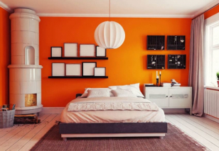
- yellow, orange – mood of cheerfulness and inspiration. It can act as an accent or background if you choose a pastel palette. Harmonizes with burgundy, graphite, rich turquoise, blue and lilac;
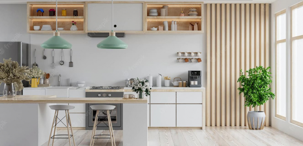
- green. Natural colors of kitchens evoke calm and tranquility. The combination with wood shades will fill the room with comfort and homely warmth. The entire palette is suitable for a kitchen set – bright light green and delicate mint, calm pistachio and rich shade of juicy grass;
- blue, blue and their shades. They have a relaxing effect on the psyche and dull the feeling of hunger. But the abundance of cold blue can cause boredom and melancholy. A contrasting combination of blue with white, gray or peach will give you the missing dynamics. In the case of a two-color set, blue can be combined with mustard, yellow, pink;
- The palette of facades ranges from sand to rich brown. Imitating the colors of wood species, such kitchens look natural. The brown palette is easily combined with other shades and this is its main advantage;
- purple. Has an ambiguous perception. Should not be used for monochrome headsets. Visually pleasing combinations are obtained in pairs of purple with mint and white.
Choosing a color for a kitchen unit
It is a mistake to believe that the question of the color of the kitchen set arises at the stage of choosing furniture. The priority palette of shades is determined by the style of the interior. So for kitchens in this style, the classics are characterized by natural colors – woody, shades of green, milky, beige. Fans of the modern and high-tech trends will prefer black and white combinations and metallic shades. White, beige and gray furniture from the manufacturer are in harmony with Scandinavian minimalism. The correct combination of furniture shades and finishing colors (floors, walls) will help you avoid unnecessary kitsch.
Basic principles:
The kitchen set should not contain more than two colors. You can add color to the perception of the kitchen with an apron. Accent fittings, stained glass or glass inserts allow you to deviate from the rule.
The basic color of the furniture occupies more than half the area of the facades. As for the color ratio of the entire kitchen, the rule of 60:30:10 applies here. Where the largest percentage is given to the neutral base of the walls, floor, ceiling.
Make sure that the furniture does not blend into the room. Exception – small kitchens, where additional accents only make the space heavier. Custom-made kitchens in noble, rich or bright colors contrast effectively against the background of calm walls. An alternative solution – pastel shades of facades against the background of an accent wall.
Keep an eye on the harmonious combination of the selected shades. The color scheme will help you choose a partner color for a visually pleasing combination of the set with the walls and apron.
Avoid total monochrome. In this case, even non-trivial shades will look boring. Paintings, panels, dishes, and shelves of contrasting colors can add missing accents.
It is impossible to answer unequivocally the question of what is the most practical kitchen color. Woody shades, a palette of green, beige and white can be called universal. These colors are self-sufficient and do not require partners. This is a classic with which you can create long-lasting compositions without fear that the interior will look old-fashioned.
Colors of a small kitchen
When planning the arrangement of a small kitchen, using color you can achieve the necessary visual effects. Confident leader – headsets in light shades. Is it possible to use contrasting and bright facades? Yes, but you should do it by adhering to the rules.
What options would be appropriate:
if it is necessary to “dissolve” furniture in the interior of the room, as is often required in studios, choose a shade close to the color of the walls. This technique is suitable when working with a pastel palette;
incorporate rich colors into the interior of a small room – blue, green, mustard – two-tone kitchens will help. It is better to choose accent facades for tables and cabinets, and light ones – for lockers;
monochrome kitchens look fresh and original, in which the color of the bottom of the cabinets duplicates the shade of the countertop.

